It’s really hard to imagine how a sector could be doing as bad as the Utilities sector in a tape that has been as strong as this one, but the reality is that when everyone expects rates to increase, they want nothing to do with interest rate sensitive sectors like Utilities. The following charts are from this week’s Sector Snapshots report which looks at the technical and fundamental backdrop for the S&P 500’s major sectors. The report is published every Thursday for Bespoke Premium Clients, so if you don’t already receive it, sign up for a trial today.
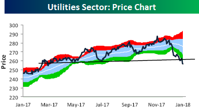
Let’s start with the Utilities sector’s price chart. After trading into extreme overbought territory late last year, investors have headed for the exits and taken the sector to its most oversold levels in well over a year. In fact, to find a time when the sector was more oversold than it has gotten in the current leg lower, you have to go back to June 2015.

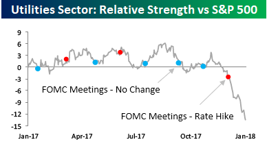
With the Utilities sector being so weak in an otherwise strong tape, the relative strength versus the S&P 500 has fallen off a cliff. Utilities is not normally a volatile sector, so that makes the recent moves stand out even more. Note in the chart too, how the recent leg lower in relative strength really picked up steam right after the FOMC’s most recent rate hike.

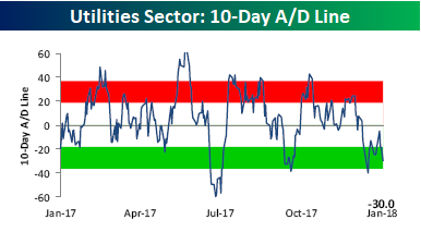
Not surprisingly, breadth for the sector has been weak. Two charts that highlight this are the sector’s 10-Day A/D line which takes a rolling tally of the net number of stocks in the sector rising on a daily basis. As of yesterday, the sector was firmly into oversold territory.

The other illustration of the Utility sector’s pitiful breadth is the percentage of stocks in the sector trading above their 50-day moving average. Currently, that stands at just 11%. Again, this is an extreme reading.


